In the beginning of May, my friend Aanya Singh reached out to me about designing a logo for Icing Collective, a magazine for artistic young-adults who are transitioning into expressive, fashion-forward contributors. The publication showcases youth fashion, beauty, art, and lifestyle.
Client: Icing Collective
Client: Icing Collective
Role: Brand Refresh

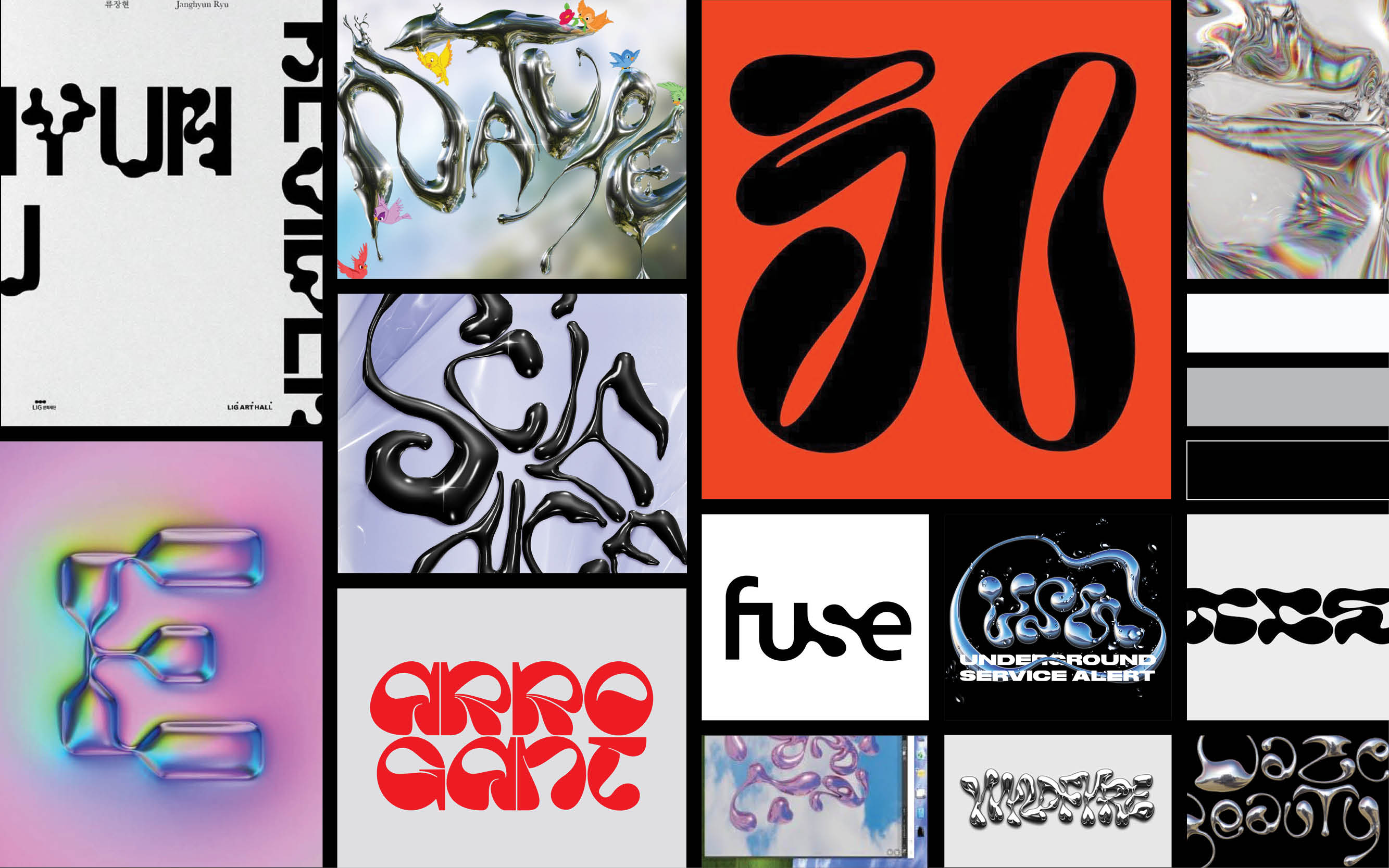
MOODBOARD
I started my process by putting together a moodboard with images that I felt best fit the direction my client envisioned. The vision: chrome ooey-gooey icing.

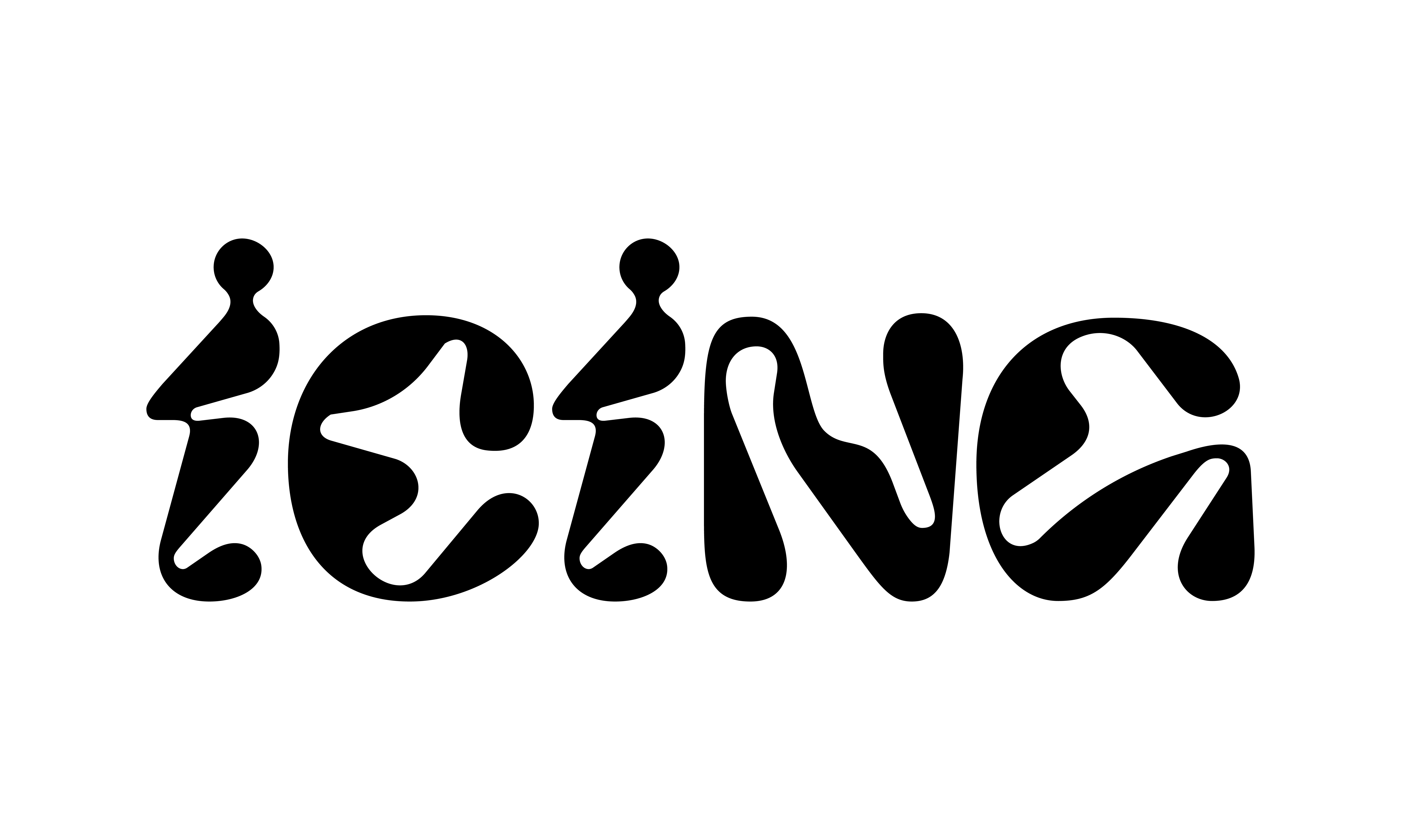
CUSTOM TYPE
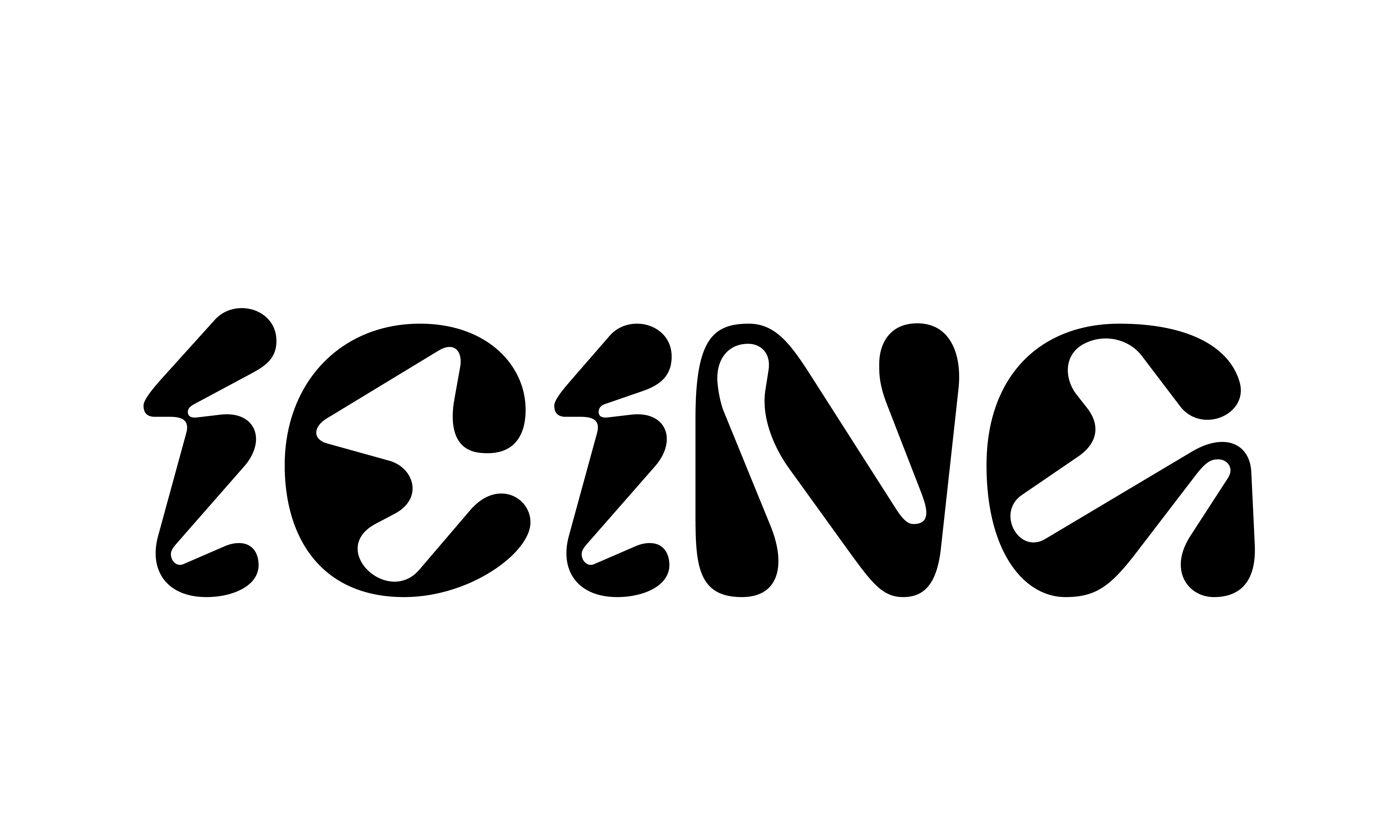
My client envisioned a logo that mimicked icing. After putting together a moodboard, I explored various typefaces that fit the icing feel. I struck gold with Pilowlava, a unique typeface that had those curves I was looking for. To add more icing gooeyness to the logo, I modified the type by adding merged tittles and rounding the harsh edges.


CHROME APPLICATION
After establishing the flat design of the logo, I brought it into Photoshop and added a silver chrome effect. I paired the chrome logo with a more simplified and thin typeface in the subtitle, collective, to create contrast.
After establishing the flat design of the logo, I brought it into Photoshop and added a silver chrome effect. I paired the chrome logo with a more simplified and thin typeface in the subtitle, collective, to create contrast.
