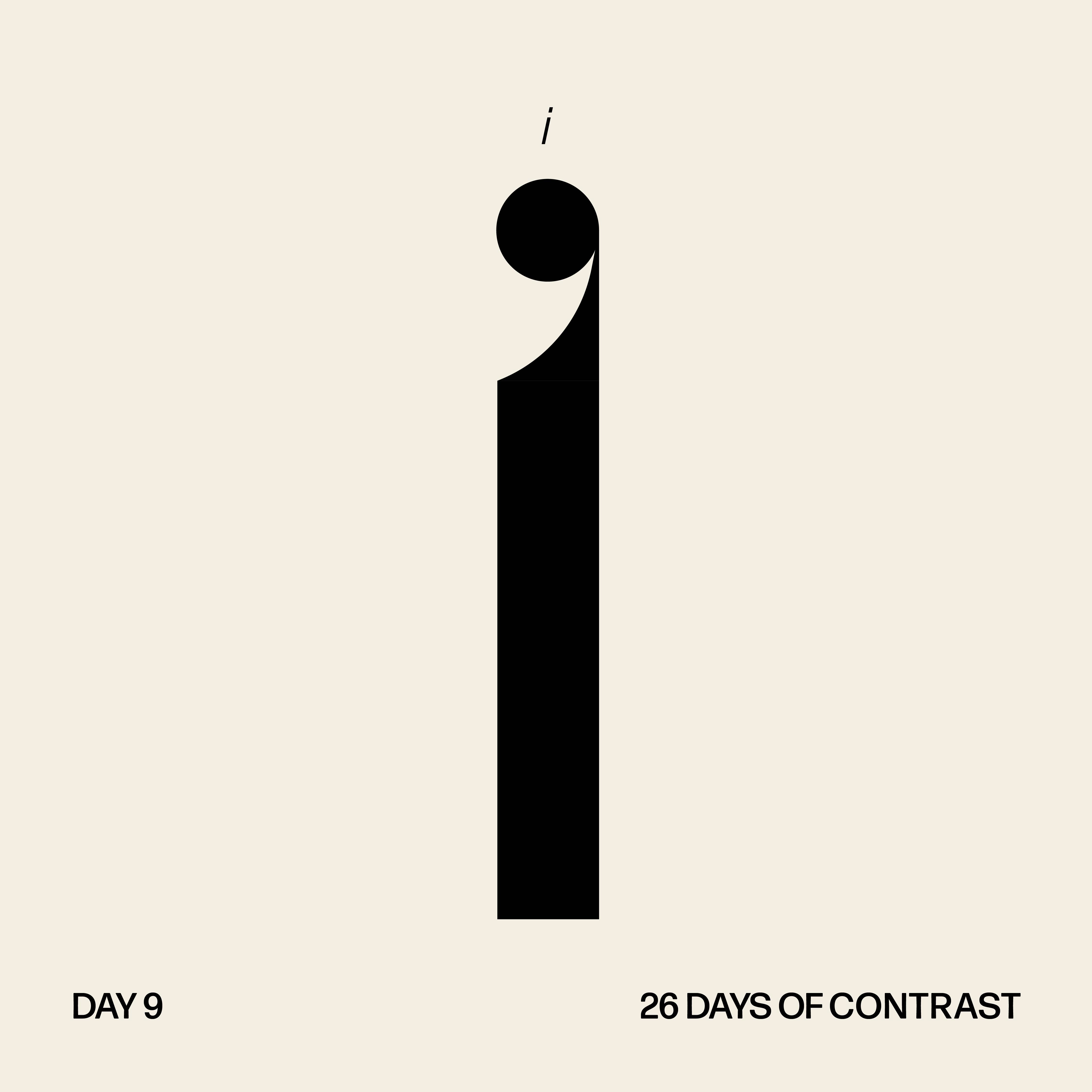
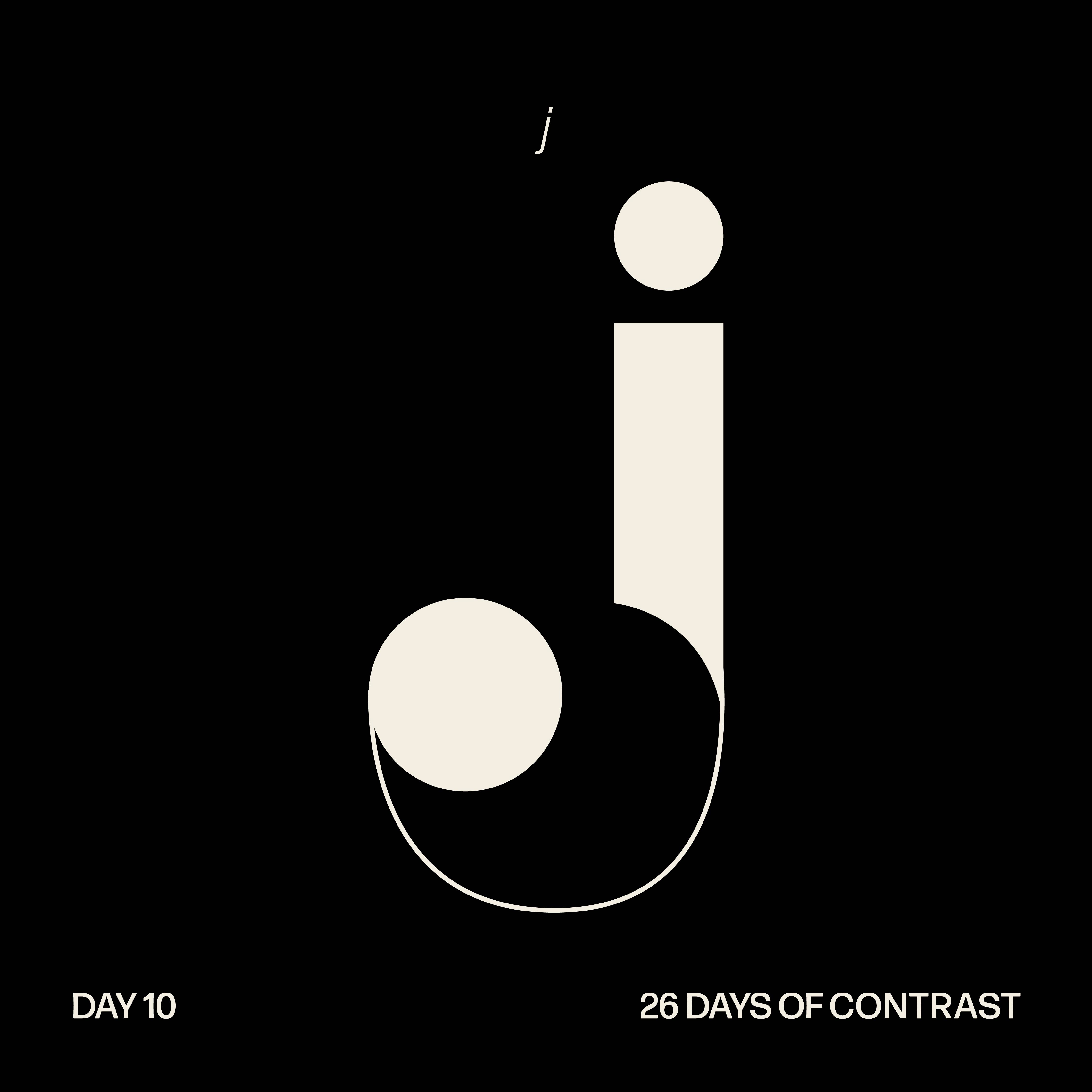
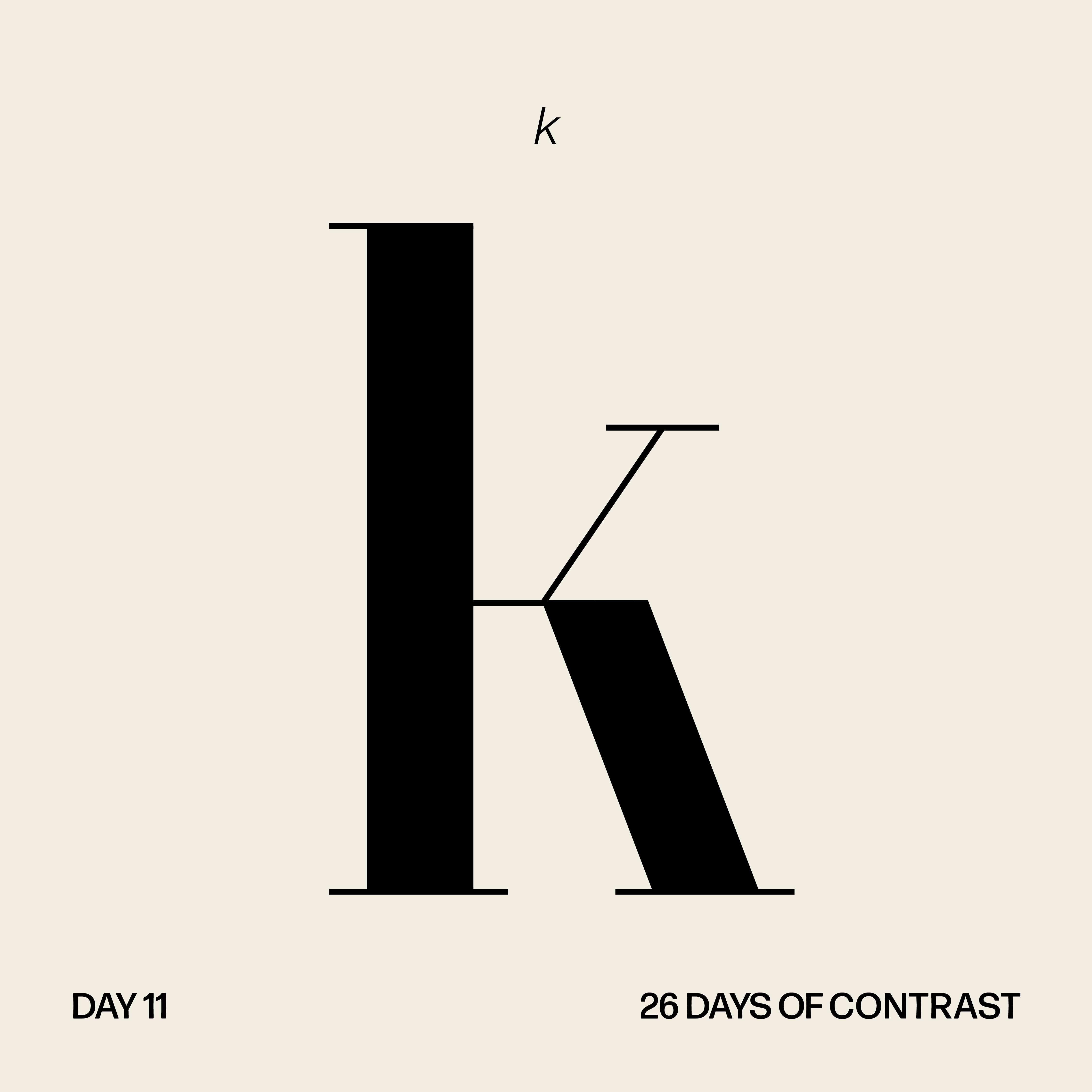
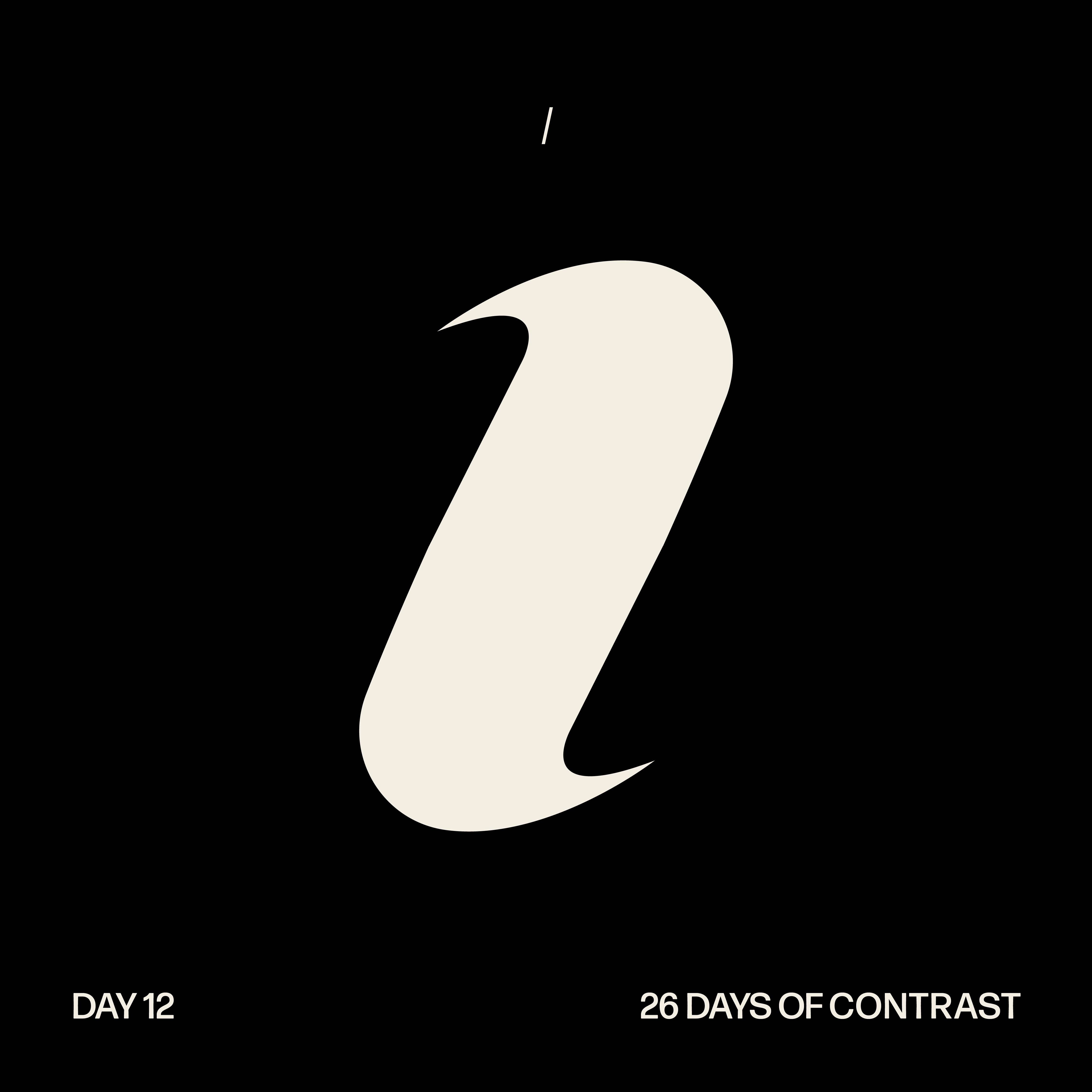
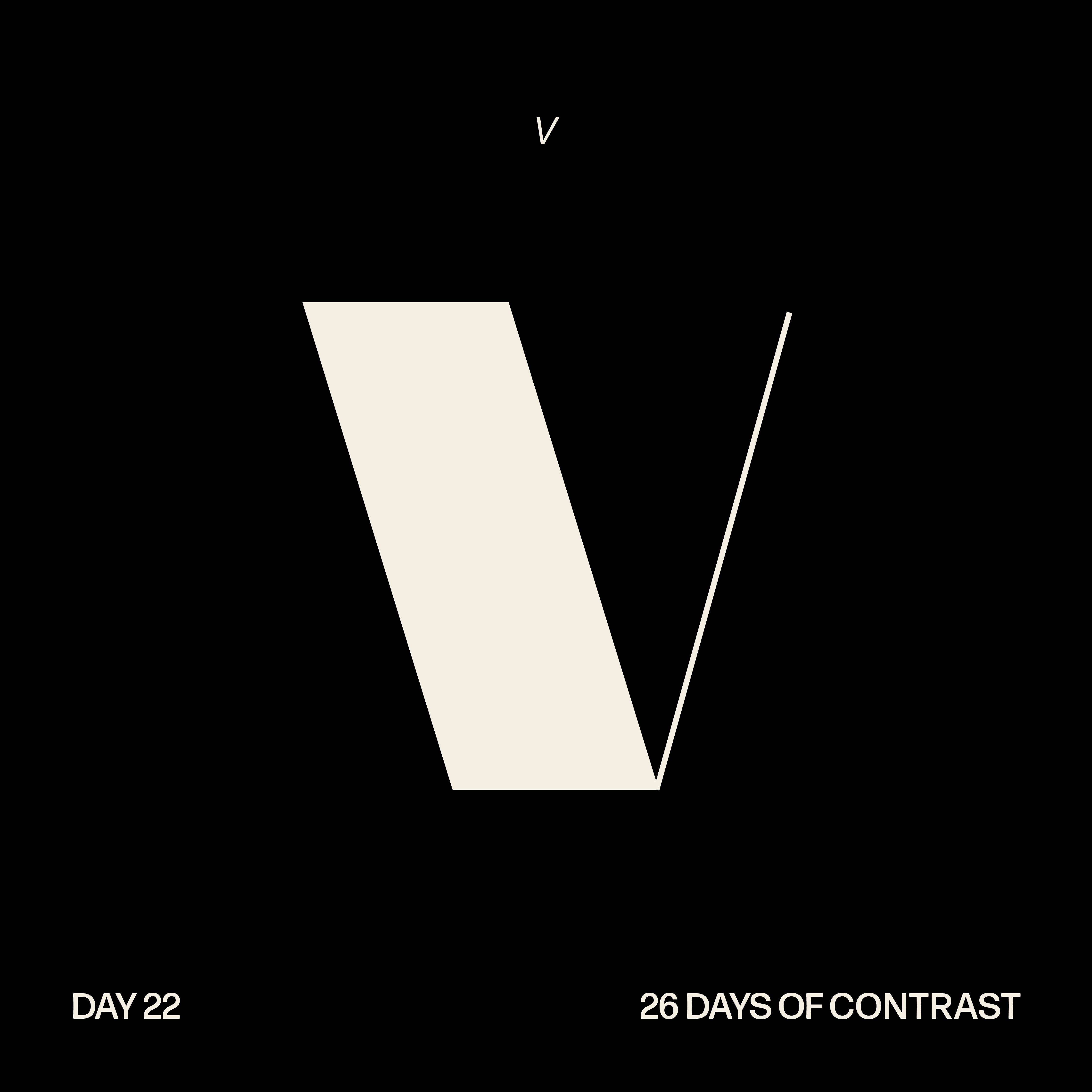
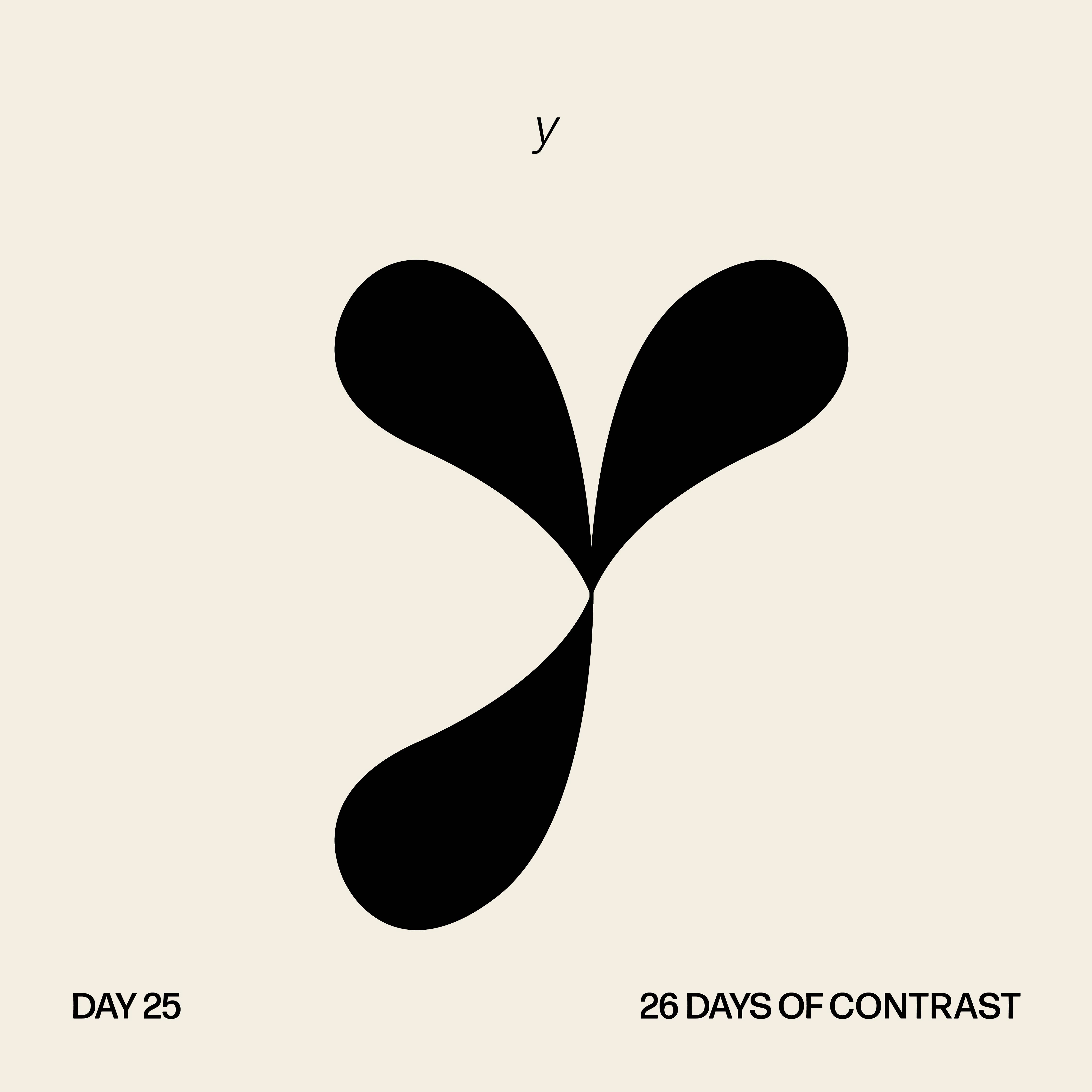
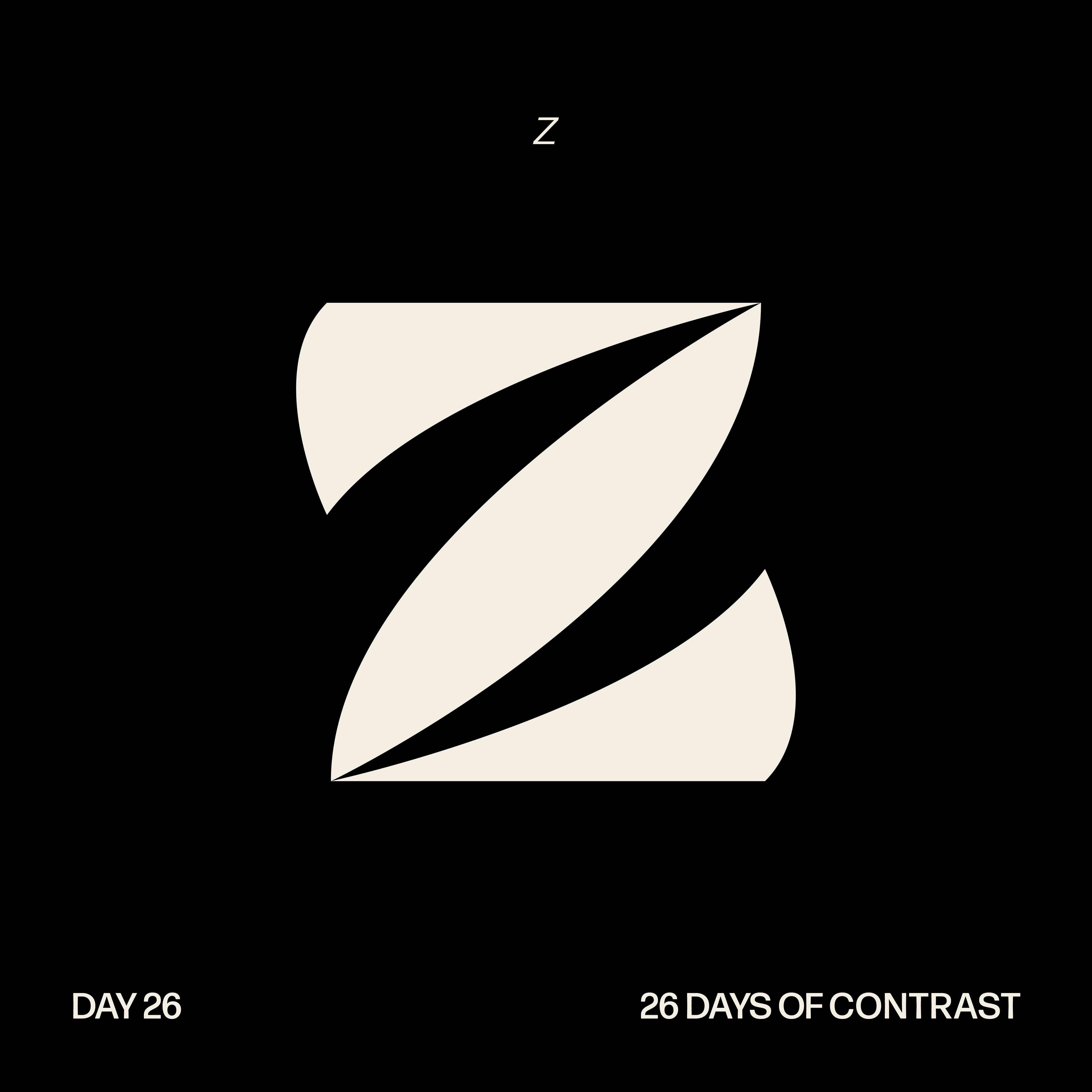
Over the course of March, I designed a different letter of the alphabet every day during the month based on the theme of contrast. I presented the final characters in the form of a booklet and a poster.
Client: Renee Stevens
Role: Typeface Designer
Timeline: March 1 - 31 2021
Role: Typeface Designer
Timeline: March 1 - 31 2021

26 Days of Contrast Booklet Cover
Process
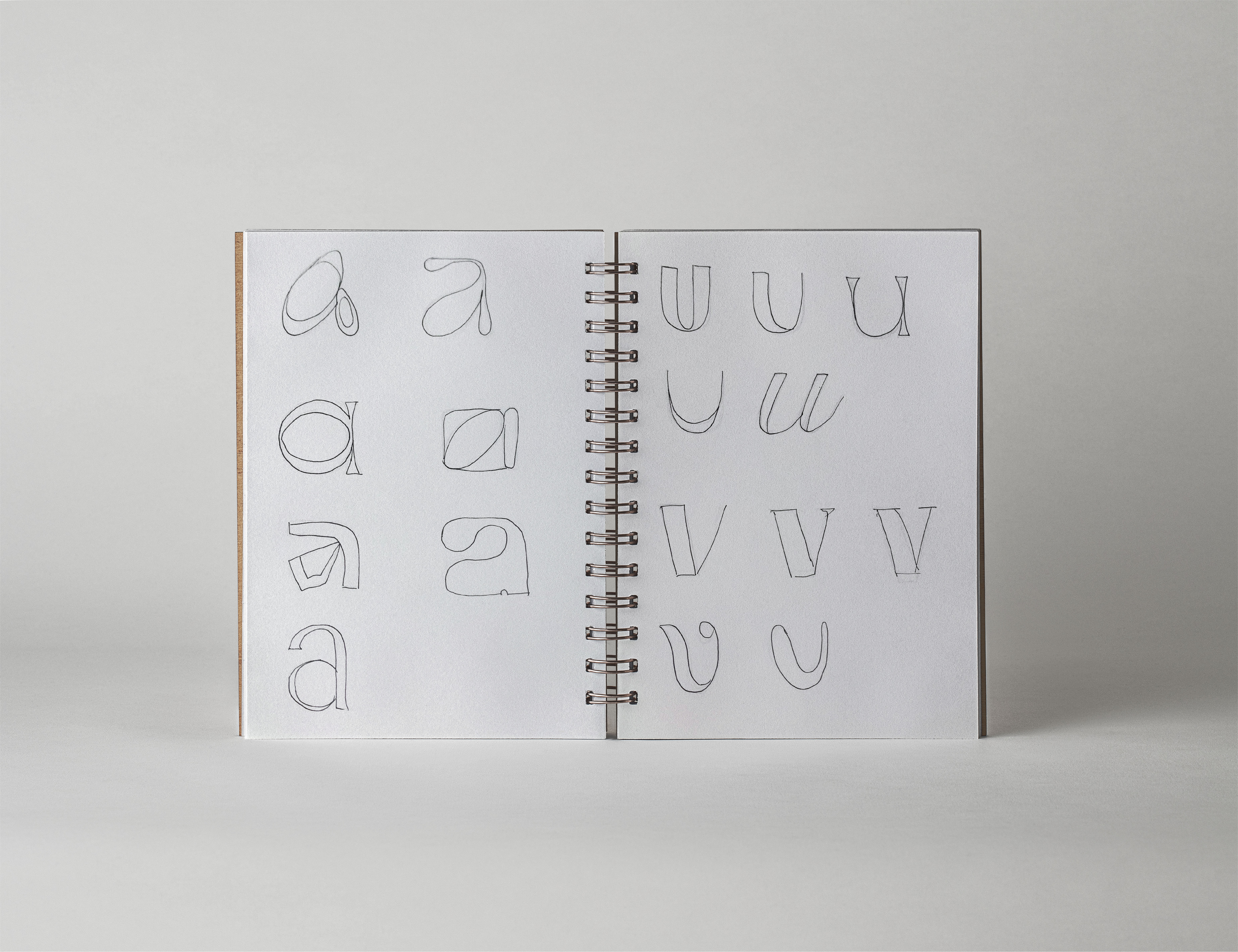
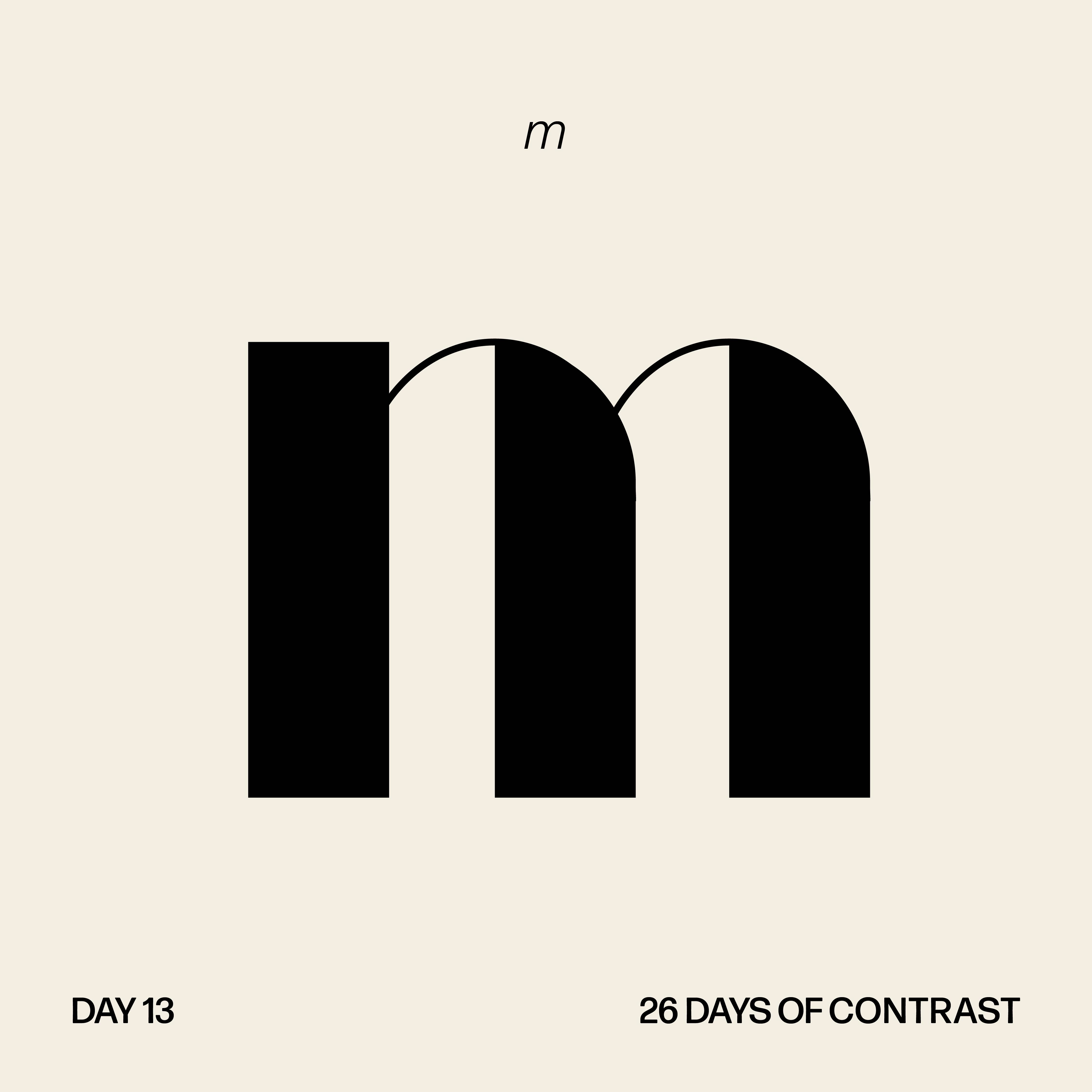
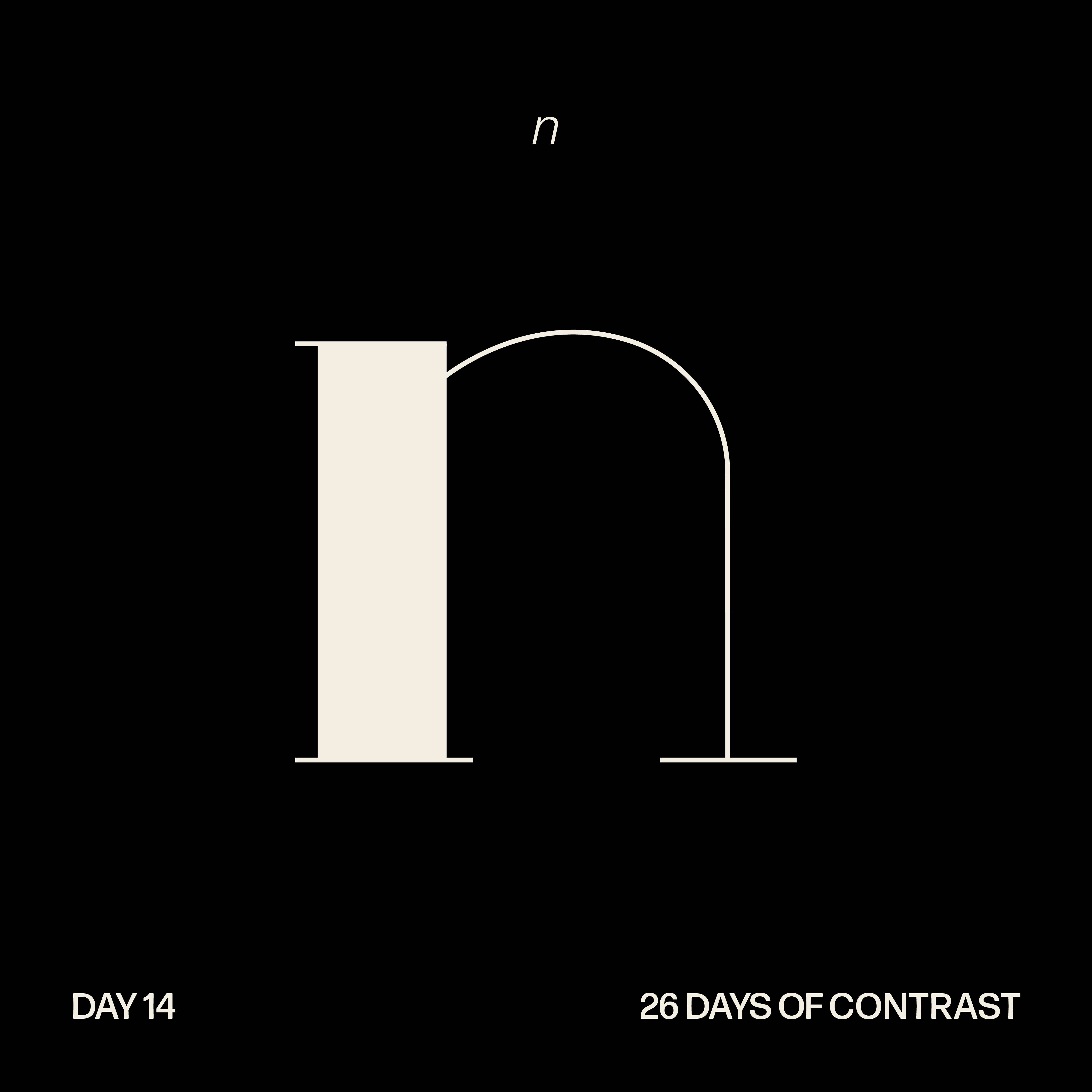
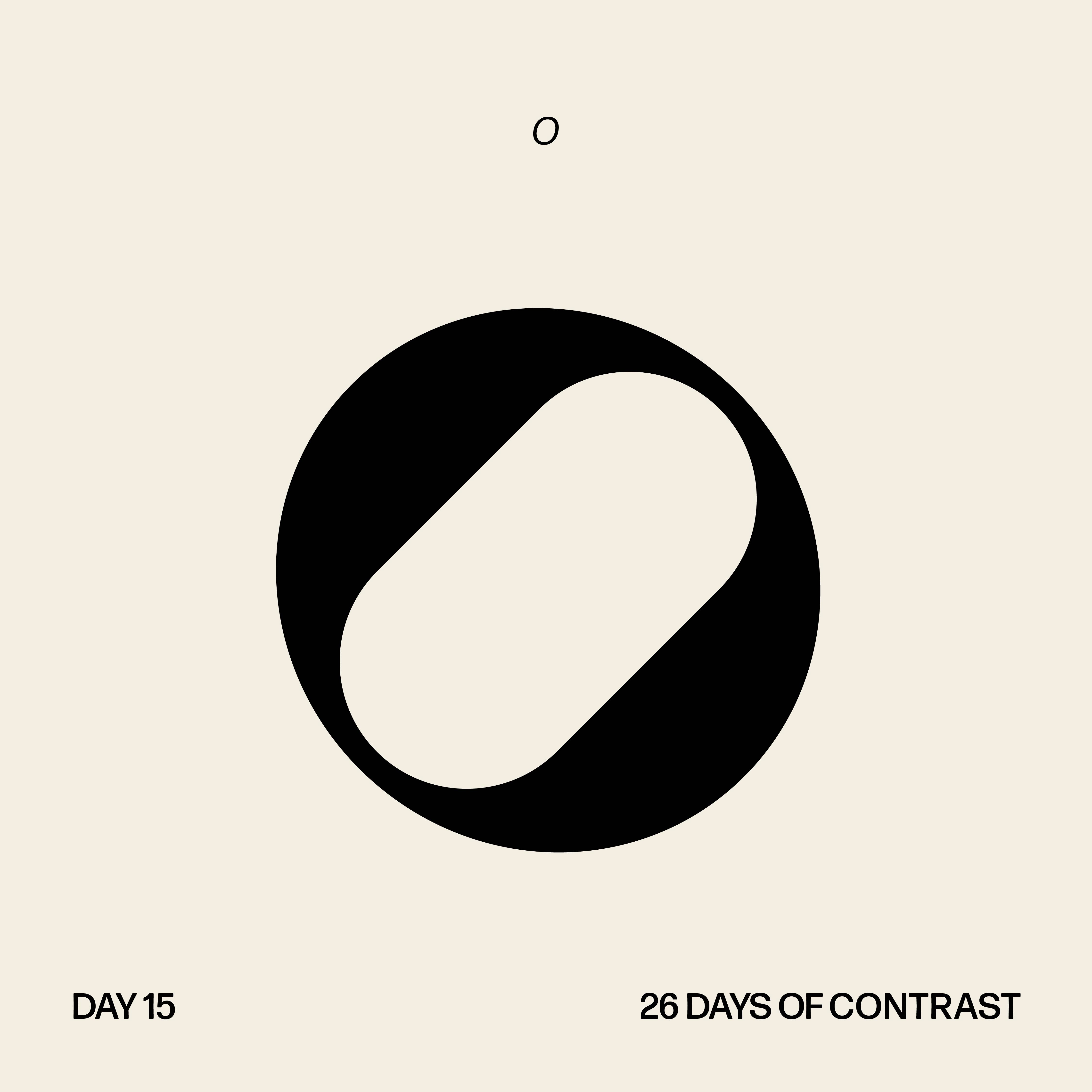
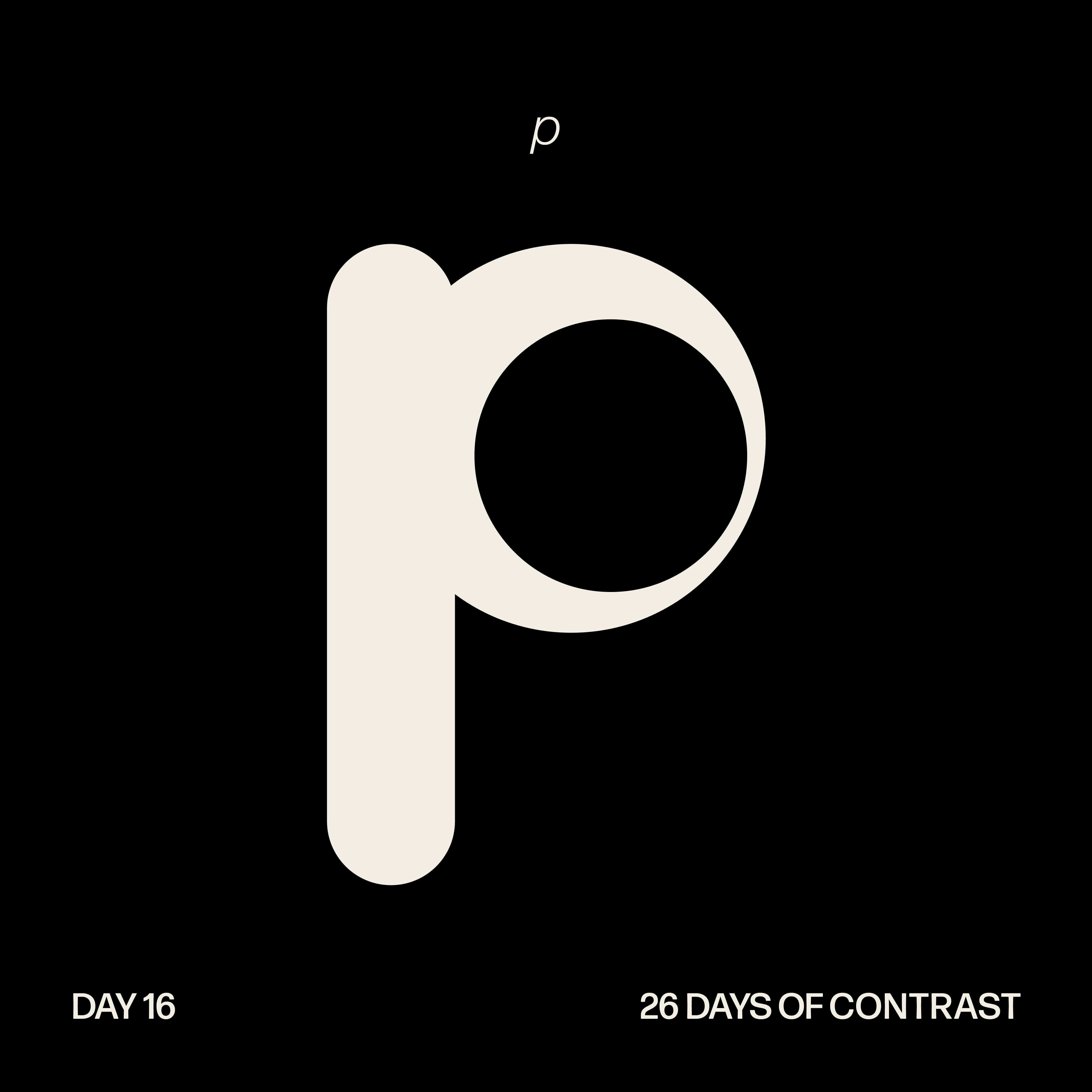
As I am interested in pursuing typography design within my career, I challenged myself to design a unique and different character every day based on a typographic theme: contrast. Before hopping into Illustrator, I began each day by sketching a few options for each letter.
As I am interested in pursuing typography design within my career, I challenged myself to design a unique and different character every day based on a typographic theme: contrast. Before hopping into Illustrator, I began each day by sketching a few options for each letter.
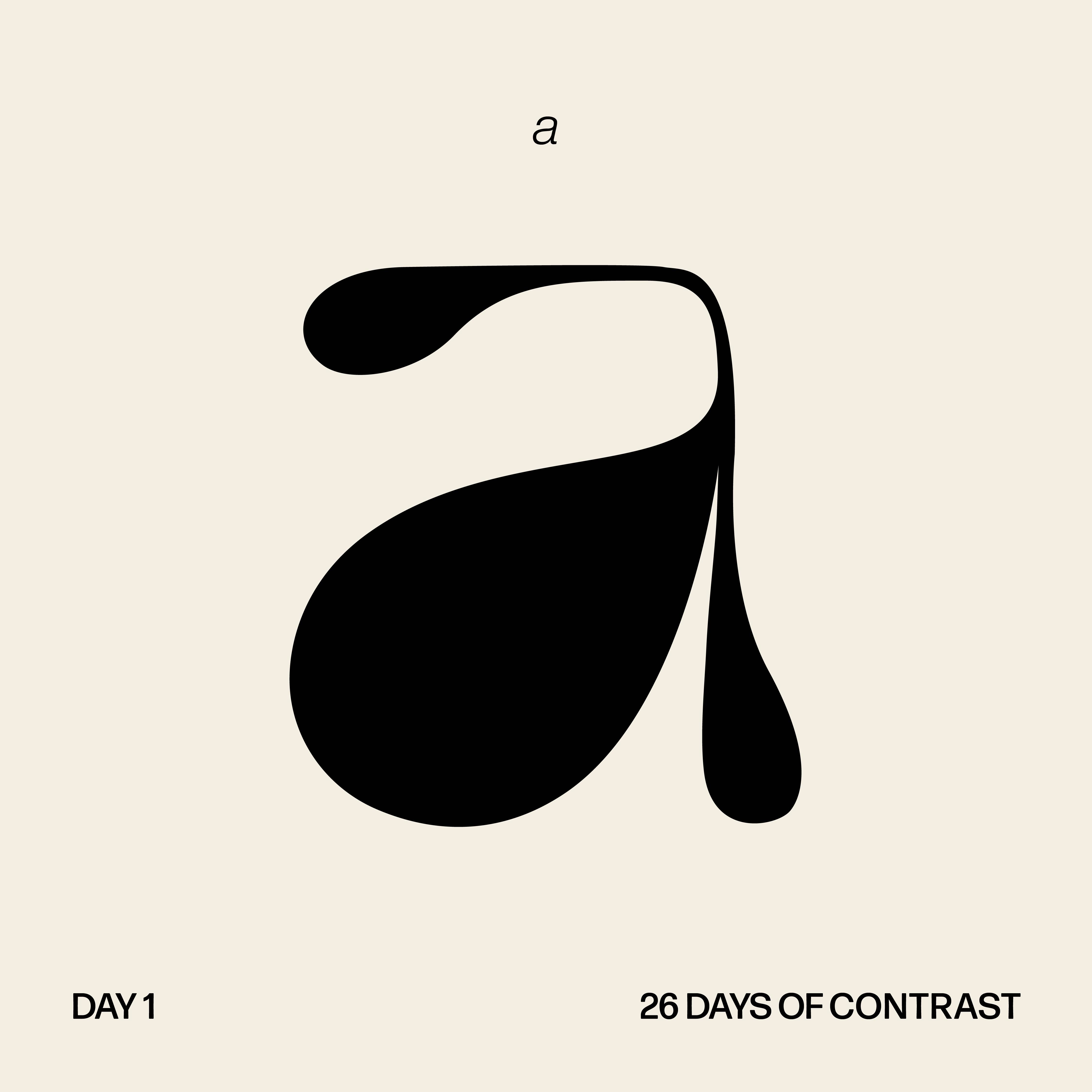
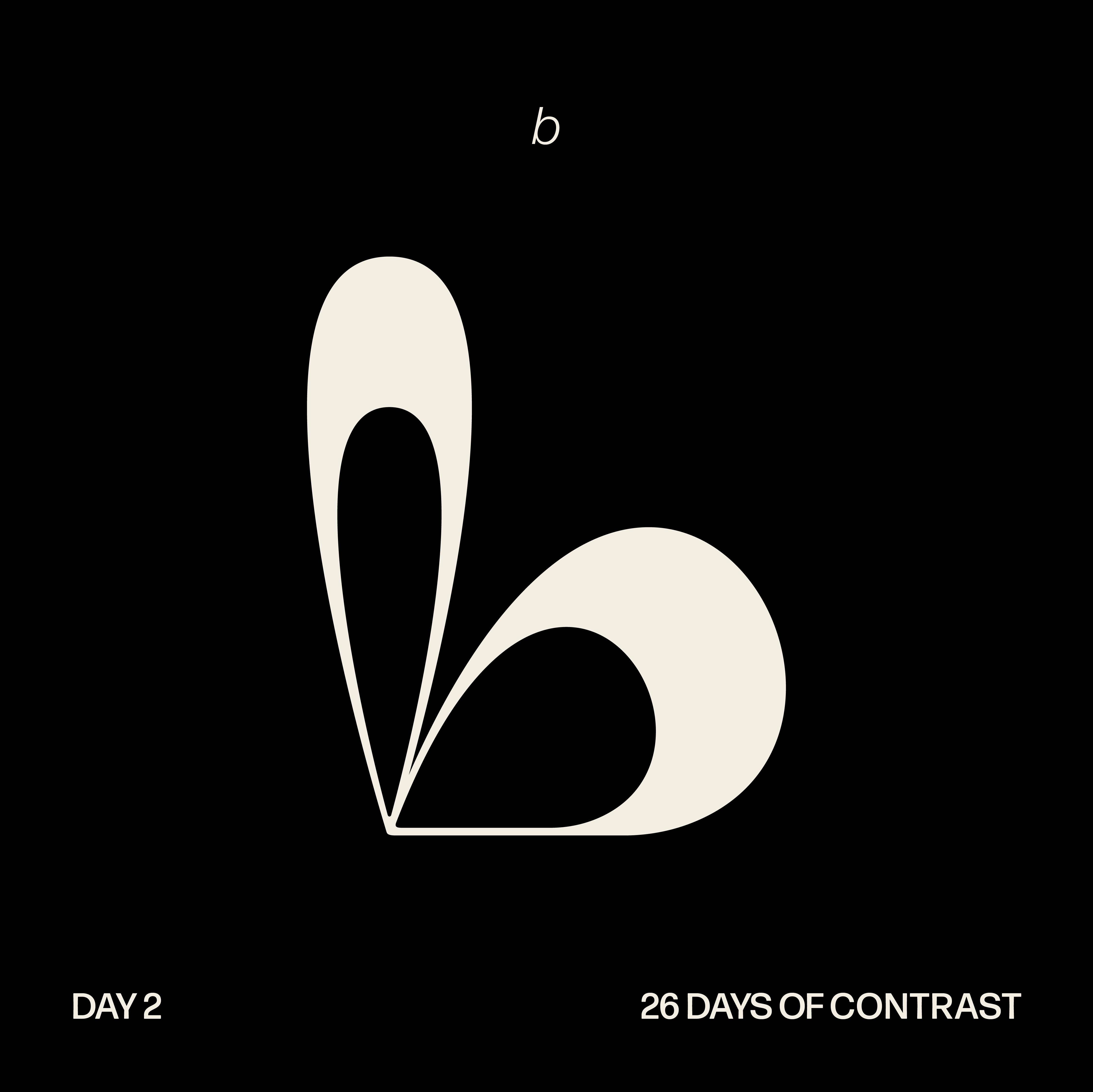
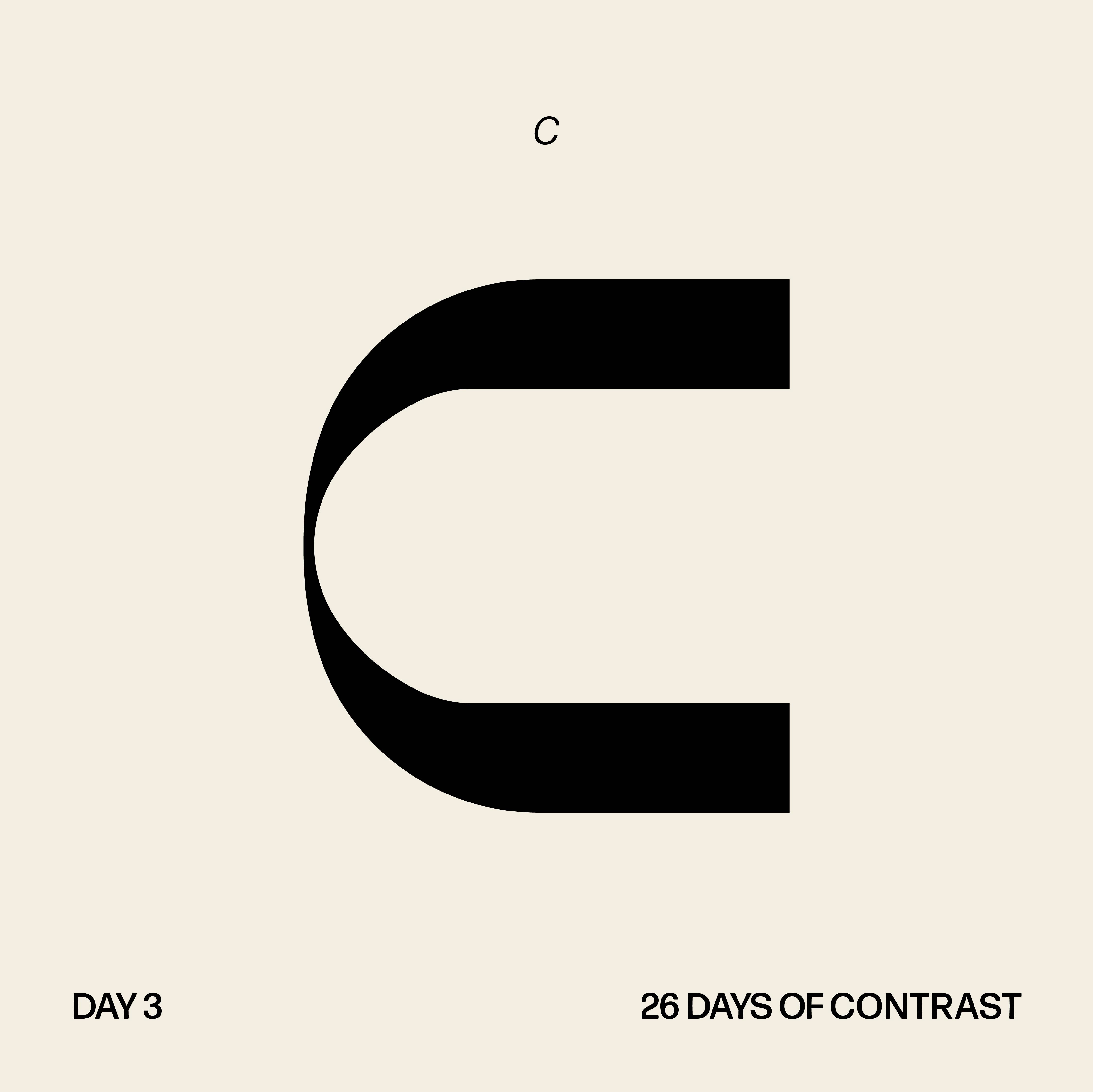
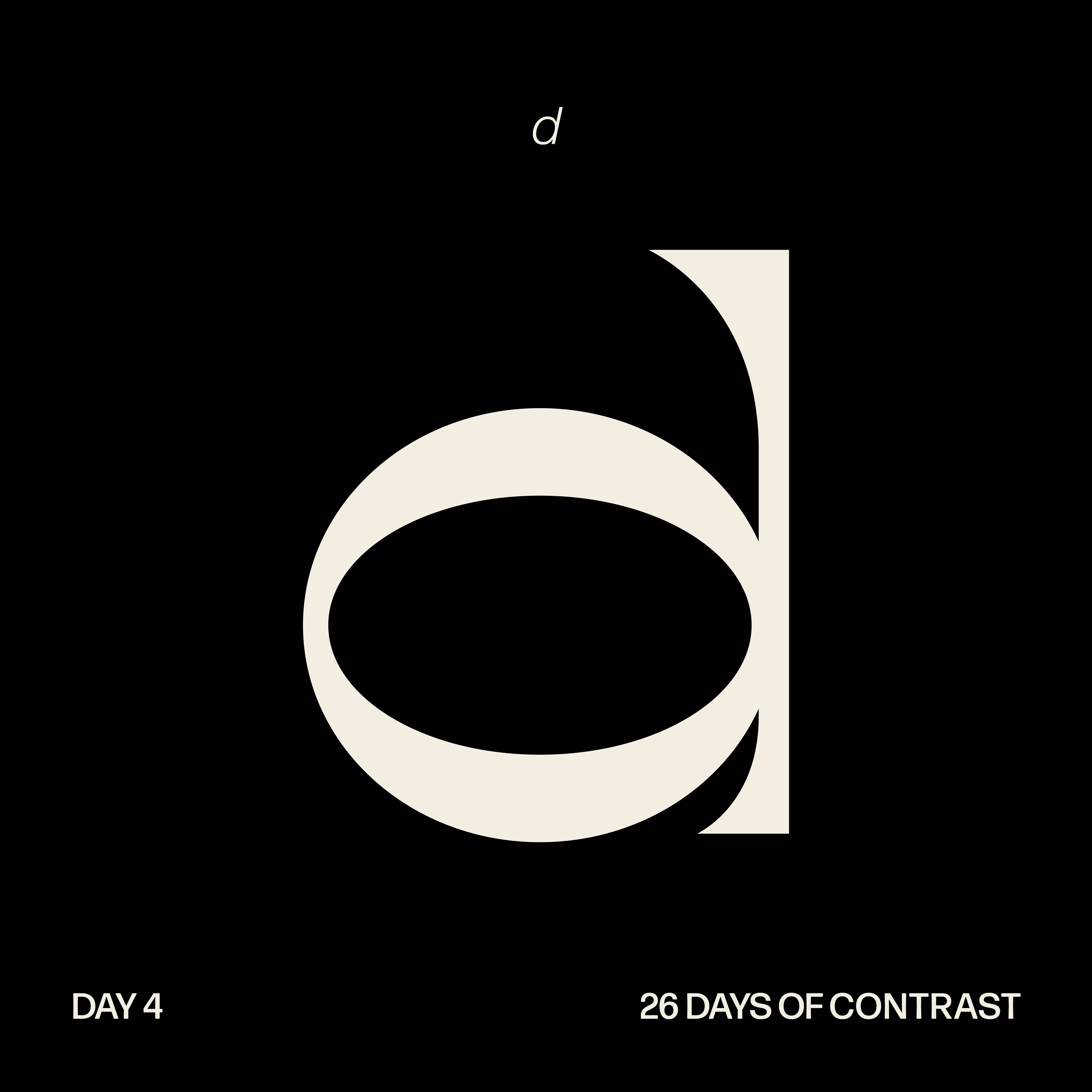
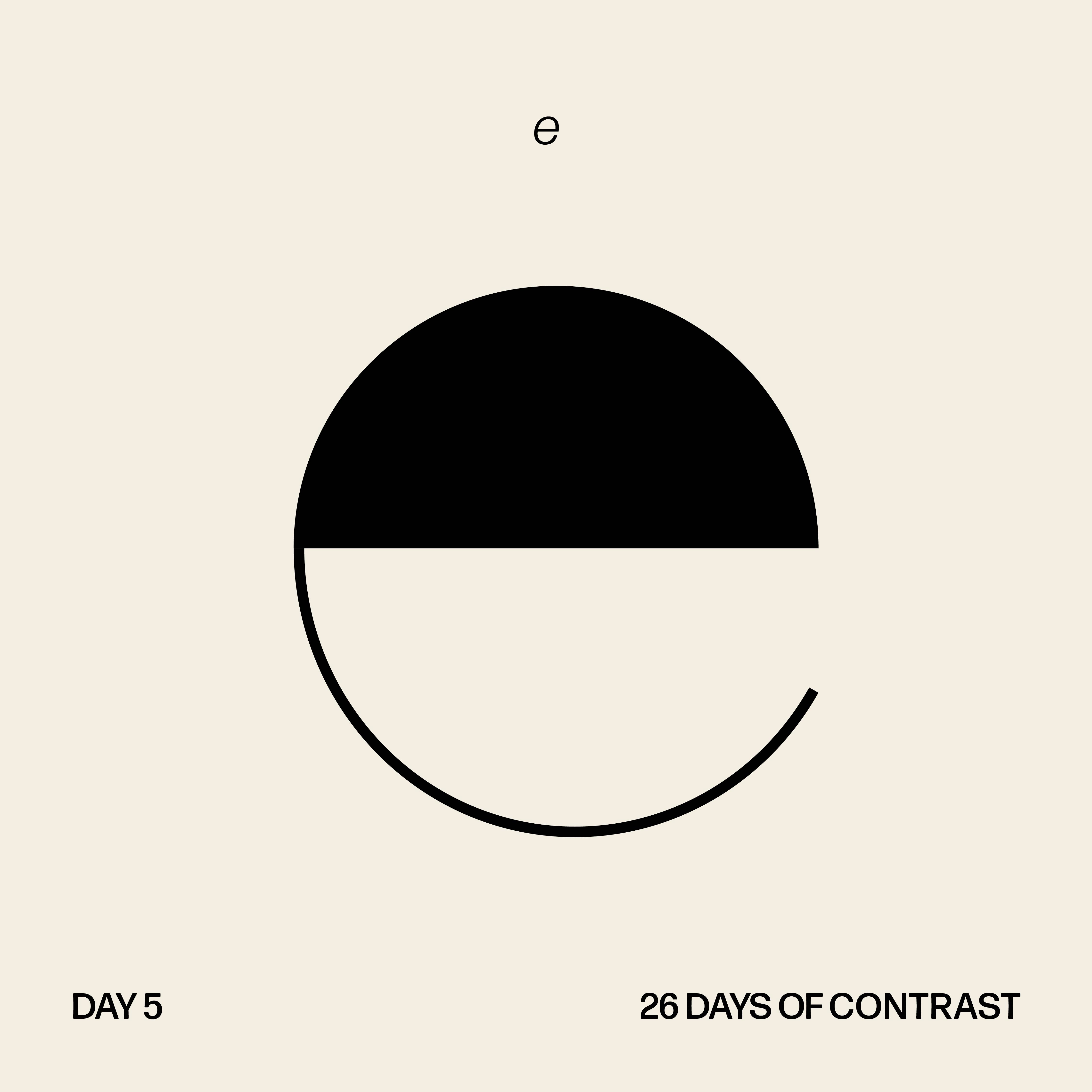
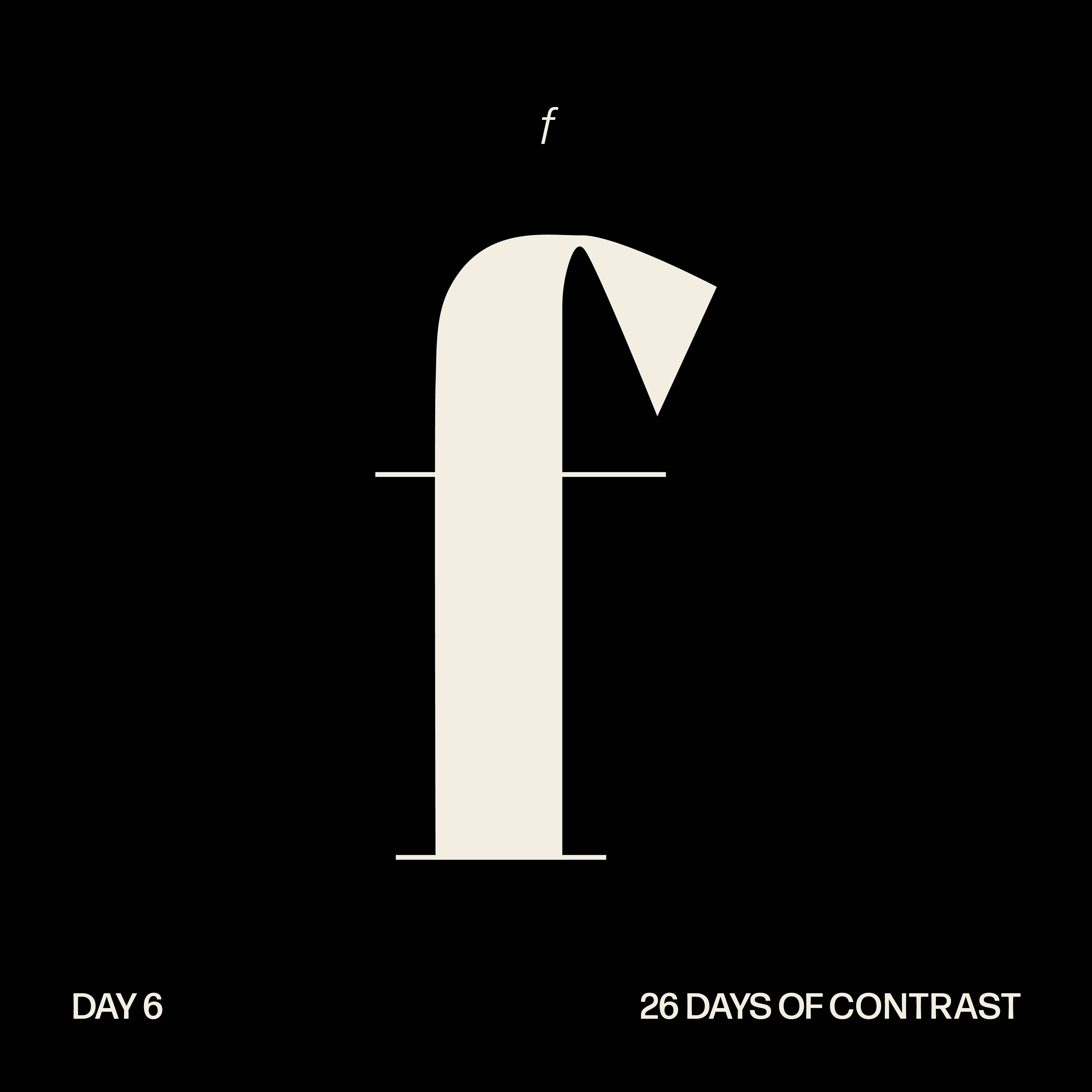

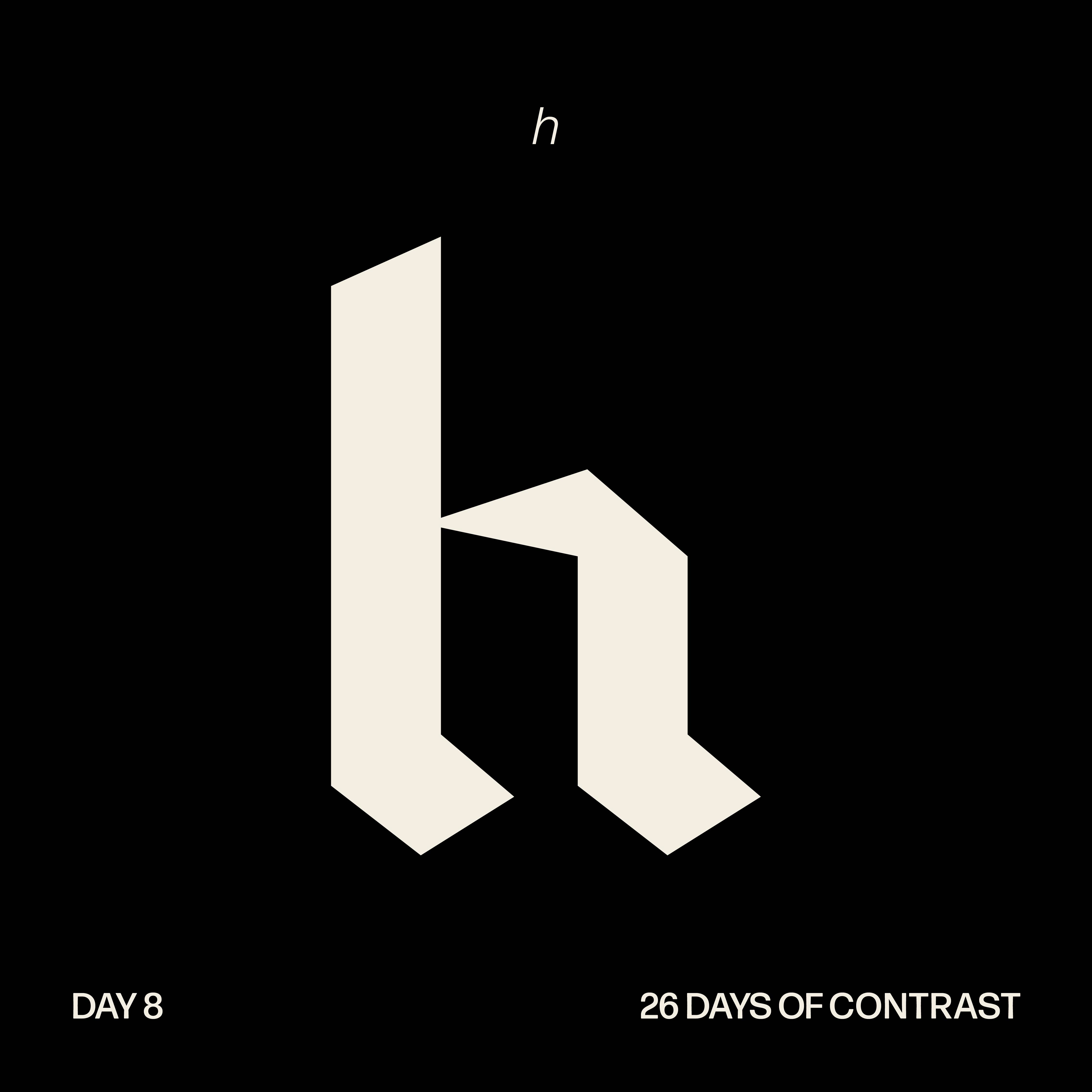
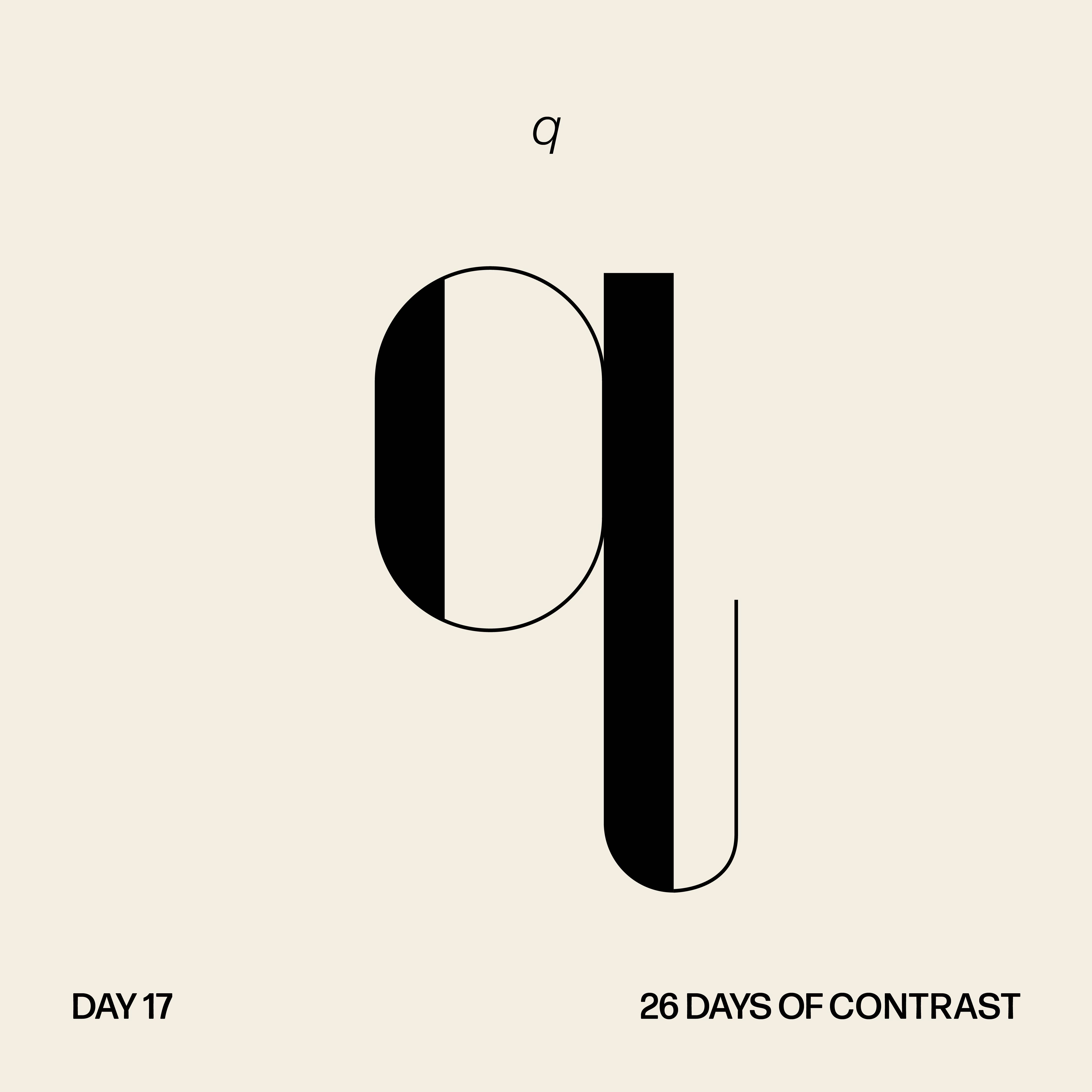

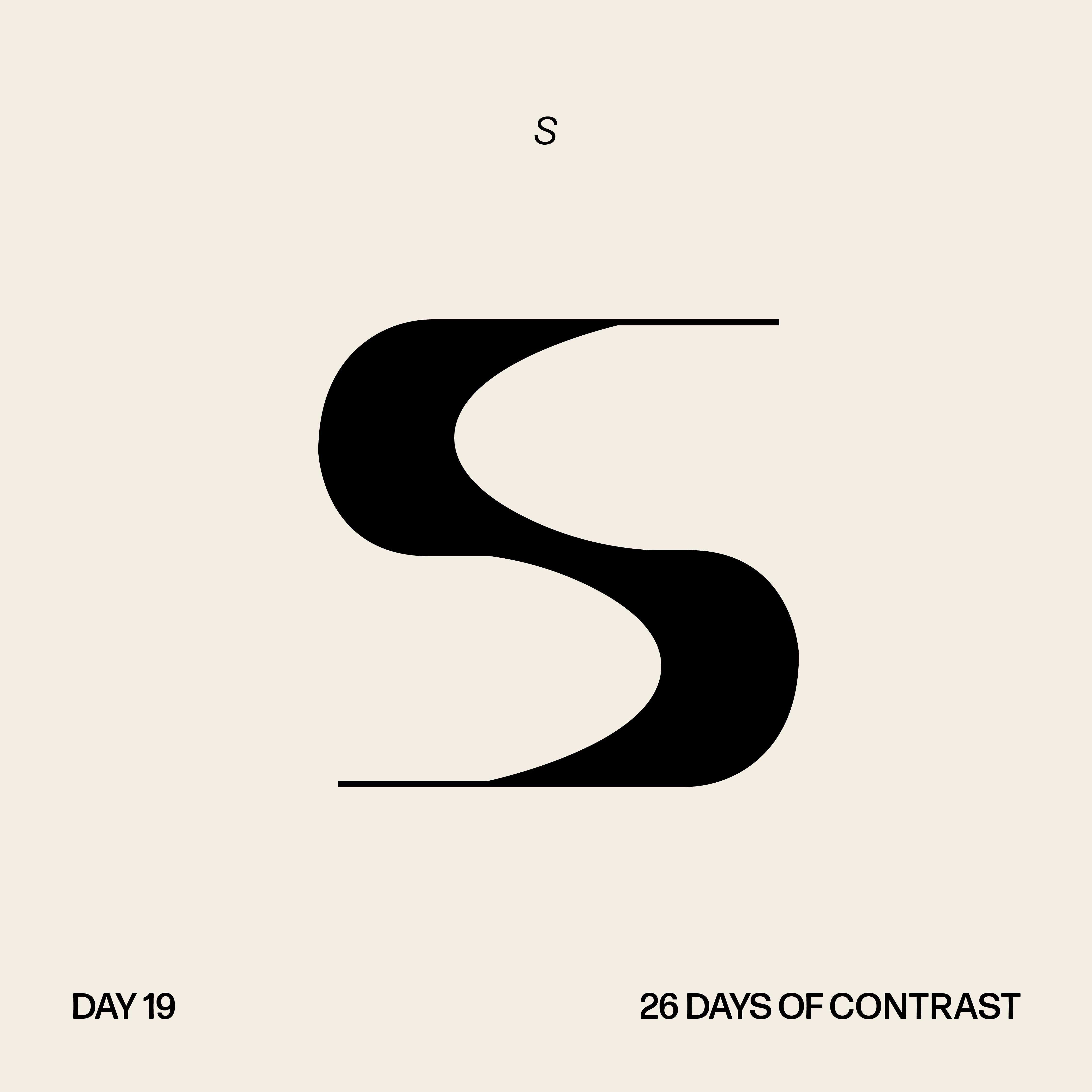
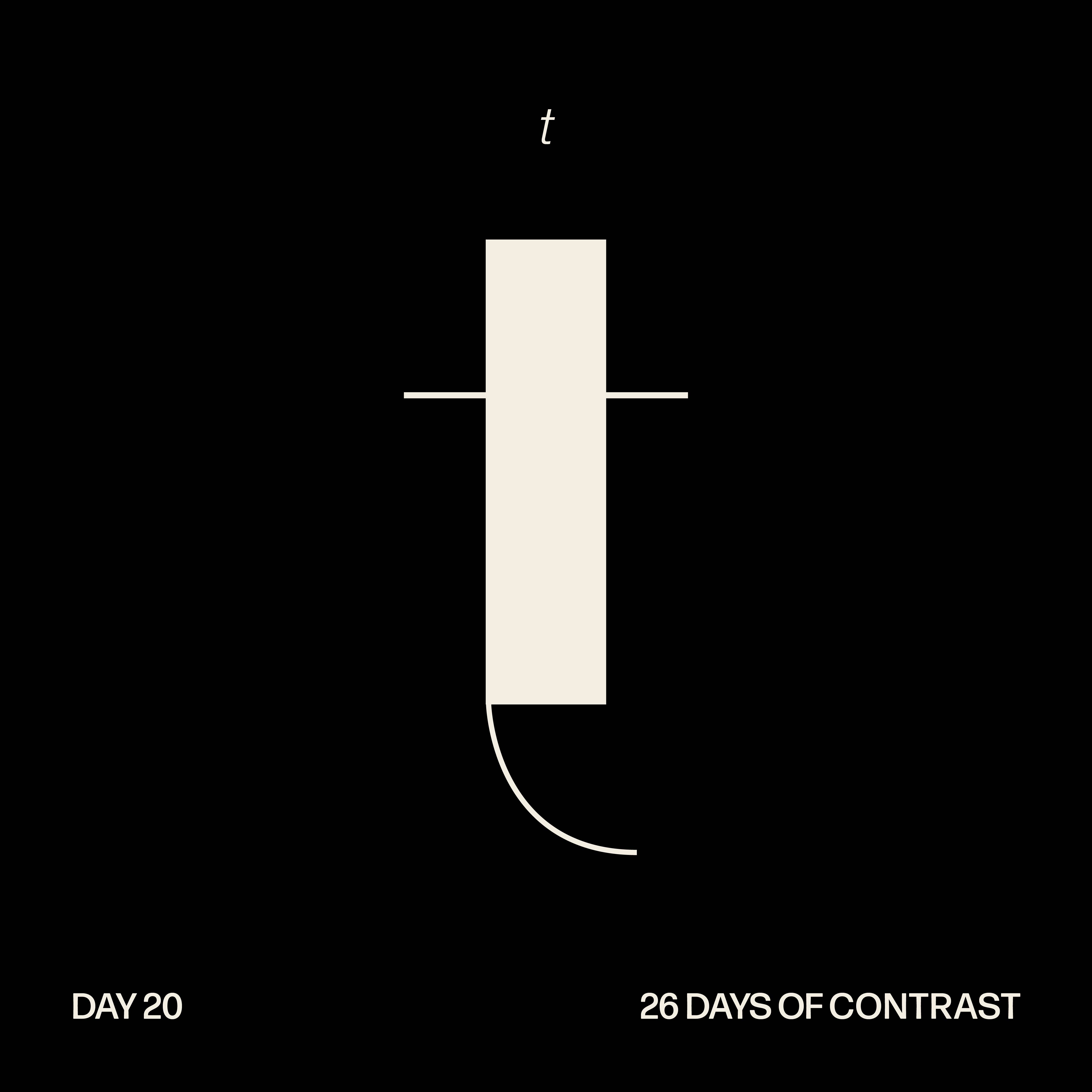
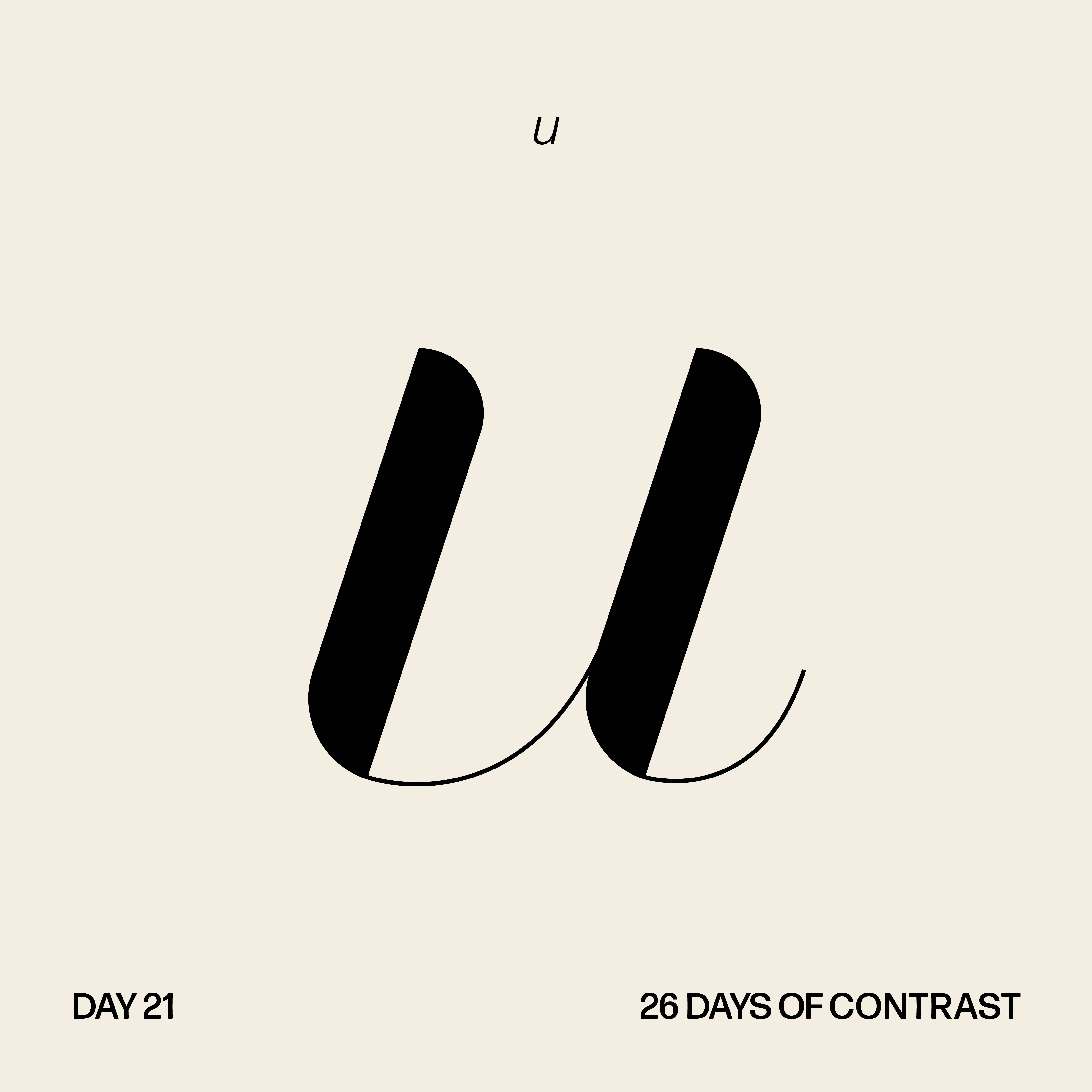


The Alphabet
After sketching, I brought my rough letters into Illustrator and began to digitize and refine each character.
After sketching, I brought my rough letters into Illustrator and began to digitize and refine each character.
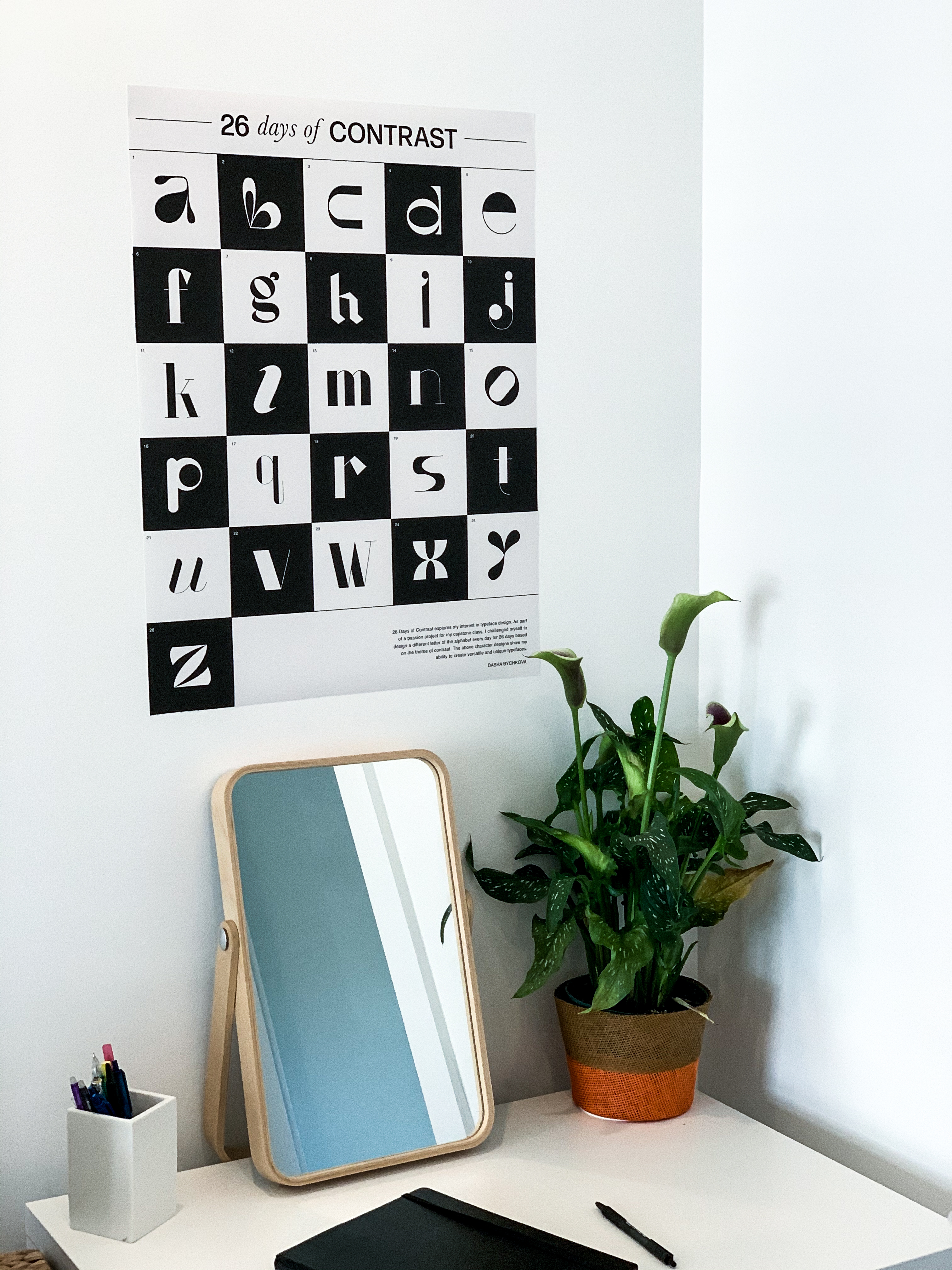
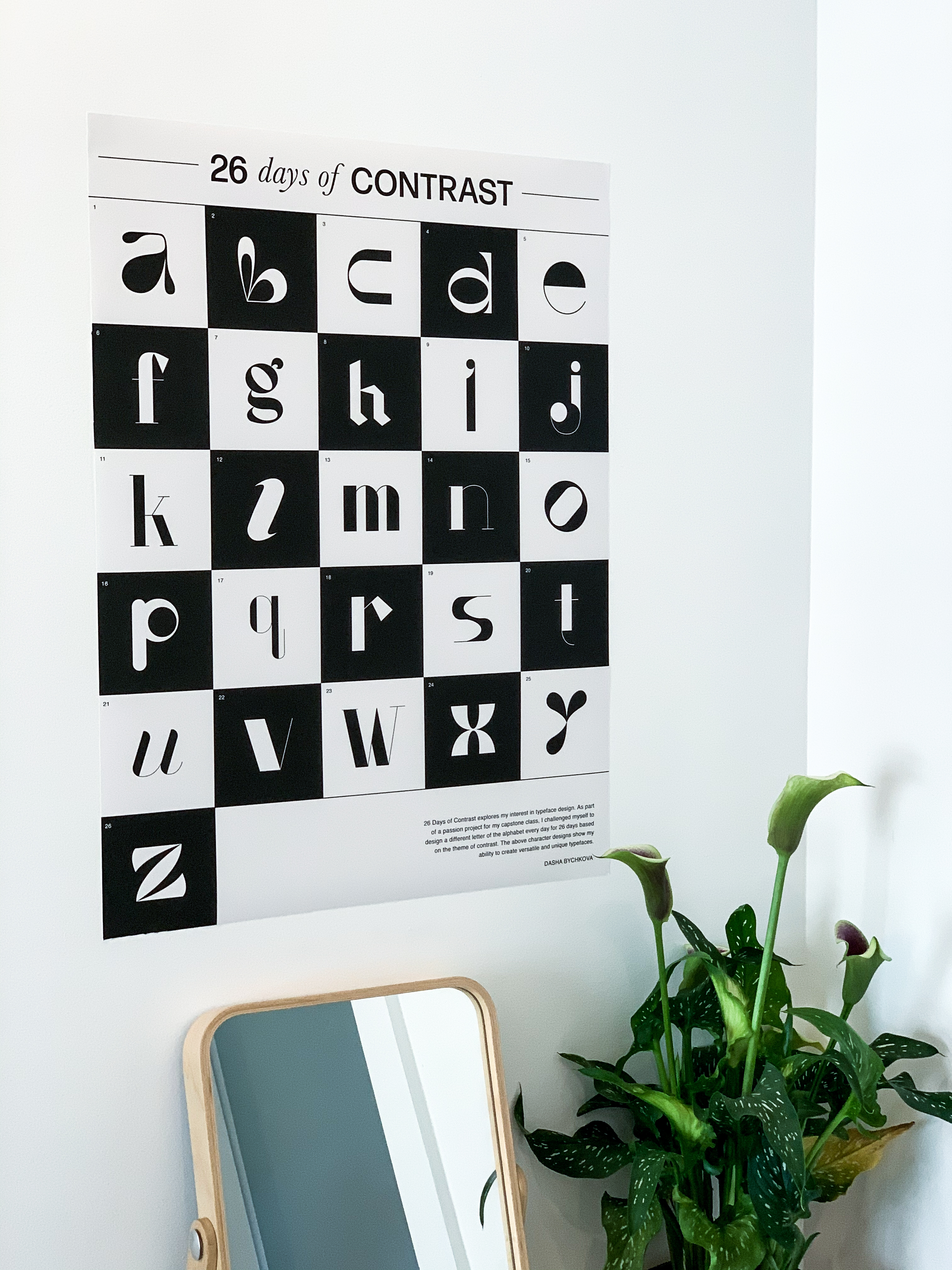
Poster
Once my letters were finalized, I wanted to present my unique alphabet in the form of a poster, which I printed and photographed. I went with a neutral yet contrasting color palette that allowed my characters to stand out.
Once my letters were finalized, I wanted to present my unique alphabet in the form of a poster, which I printed and photographed. I went with a neutral yet contrasting color palette that allowed my characters to stand out.
26 Days of Contrast Booklet Cover
26 Days of Contrast Booklet
Once my letters were finalized, I wanted to present my unique alphabet in the form of a booklet.